
Over the last year, I have been working on incorporating AI coding agents into my everyday workflow for delivering Salesforce projects. I started off with using Cline and OpenRouter. But it seemed like a tool that worked well for development and architecture-related tasks, but in my day job non-coding tasks take up a decent amount of bandwidth. Depending on the project and role, it can mean added tasks of product research, working on generating readouts for meetings, planning an entire project timeline with a sprint-by-sprint plan, preparing client presentations for approvals and ideation, to name a few.
Cline lived inside VS Code and on many occasions that proved to be an obstacle. Building a client deck inside an IDE was never going to work well.
Encouraged by what I saw in a few YouTube videos, I took a chance on a paid Claude plan and that has completely changed the way that I use AI in my daily workflows. The fact that a Claude Pro plan provides access to Chat, Cowork and Claude Code is a neat hat-trick of features that can cover most of what I typically wish to do with AI. I am definitely worried about an ecosystem lock-in and wonder what would happen if and when Anthropic decides to squeeze customers in a bid to satisfy investors and pad their bottom line (like every other subscription service has been doing post-pandemic). But for now, I think the price point provides enough value.
Since my adoption of the Claude tooling, I’ve been on a quest to evaluate popular third party skills and find a fit for my Salesforce projects delivery work. I sat down to write that up as a list of 6, ranked by how often I actually reach for them.
I got as far as item one. The graphify entry kept growing. The most useful thing I have to say about it is the mistake I made with it, and that mistake needs a few hundred words of setup before it even reads as a mistake. So graphify gets its own post, which is this one. The rest of the list (markitdown, impeccable, draw.io, excalidraw and ponytail) will follow separately.
What Graphify Is And How A Build Works
This skill got my attention when a YouTube video claimed that it could reduce my token usage by nearly half or even more. I think there is some nuance to that claim. I think the real benefit is that it gives the agentic harness a better way to get at complete information on a topic, rather than whatever handful of files a keyword search happens to turn up.
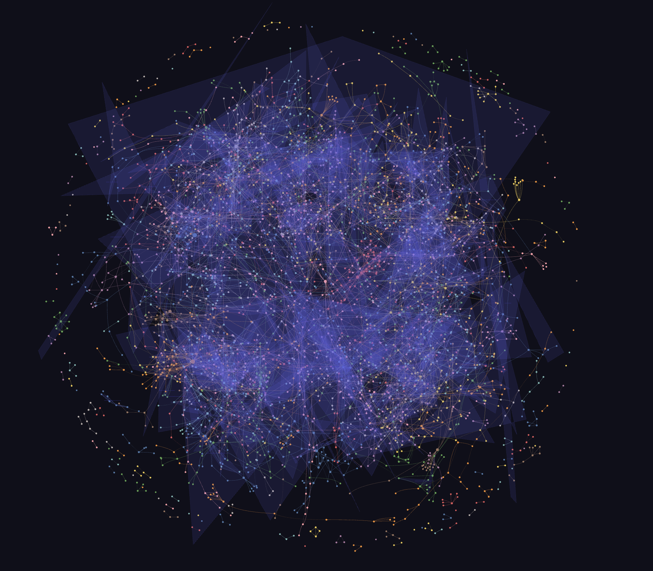
You point it at a folder (documents, code, PDFs, images, video) and it builds a knowledge graph you can keep and query across sessions. Three outputs land in a graphify-out/ directory: an interactive HTML graph you can open in a browser, a graph.json, and a GRAPH_REPORT.md that describes the whole thing in plain language. That last one is the file I actually read.
Four ideas make it more than a file index.
- God nodes are the most connected concepts in your corpus. On one of my graphs the top node is the main requirements document, which is unsurprising, and the second is a rendered process diagram, which I did not see coming.
- Communities are clustered subgraphs, each one meant to get a short name during the build. One of my graphs has 358 of them.
- Hyperedges hold group relationships. Not “A relates to B” but “these five things form one dashboard,” kept as a single fact.
- Surprising connections are the bridges between clusters that you never thought to ask about (more on this later).
The extraction is semantic and there are no vector embeddings involved anywhere. There’s no API key requirement either. Code is read structurally rather than by a model, which makes it deterministic and free, while documents and images do need a model, and if you haven’t set a Gemini key then Claude itself does that reading.
The bit that makes it usable on client work is the audit trail. Every edge is tagged EXTRACTED, INFERRED or AMBIGUOUS, with a confidence score attached. One of my graphs comes out at 79% extracted, 20% inferred, 1% ambiguous. When what I’m producing ends up in front of a client I need to see which parts of the graph are quoting an actual document and which parts are the model joining dots.
Mechanically, a build walks the folder and sorts files by extension, reads them, clusters the result, runs an integrity check, names the clusters and writes the outputs. That first step is the one that got me, and I’ll come back to it.
What A Graph Build Actually Costs
The initial graph build does consume a lot of tokens, so run it at the beginning of a new day or usage session to reduce the probability of Claude’s session limit being hit (assuming that we are on a Claude Pro Plan and we aren’t buying extra usage credits). graphify keeps a cumulative tracker, so here is a breakdown:
| Graph | Runs | Tokens |
|---|---|---|
| Project documentation | 16 | 7.2M input / 1.6M output |
| Salesforce codebase | 2 | 1.17M input / 210K output |
The documentation corpus grew from 65 files to 124 over three weeks, and a single rebuild in that window cost 2.07M input tokens by itself.
I learned the timing rule the hard way. I once kicked off a full rebuild at 3pm and then couldn’t do much else for the rest of the afternoon. After the first build the incremental update only re-reads what changed, so it costs a fraction of a full run.
The Mistake: Metadata That Never Made It Into The Graph
After tasting success with the documentation graph, I built another graph over a Salesforce codebase. It came out at 9,366 nodes of Apex, LWC and triggers. Integrity check looked clean and the graph looked complete.
So I started treating it as a finished product. The solution design for the build named the objects and fields the org was supposed to end up with, and what I wanted was a status against each one: is this in the org yet, or is it still to build. So I took those API names and asked the graph about them. Anything it didn’t know about got marked as not yet built. It’s the obvious move and it felt rigorous, because the answer was coming from the codebase rather than from my memory of who had told me what.
Nine of those names came back as missing: eight fields and a platform event.
Every single one of them already existed in the org. One of them (let’s call it Retry_Status__c) is a retry mechanism running in production today, and I had written myself a note weeks earlier saying we should reuse it. And that list wasn’t a private scratchpad, it was going into planning. Somebody could easily have spent a few hours rebuilding metadata that was already sitting there working, on my say-so.
When I went digging into why, the answer was sitting in the first step of the build. graphify sorts files by extension, and while .cls and .trigger are on its list of code, .xml is on neither its code list nor its document list. Salesforce metadata is .object-meta.xml and .field-meta.xml. So over 500 objects, nearly 7,000 fields and around 200 flows had contributed exactly zero nodes to that graph. A field only existed in it if some Apex class happened to mention it in source.
I changed two things after this finding.
First, I stopped asking a graph whether something exists. I had Claude Code write me a small script that parses the metadata XML directly into an index of every object and every field. That index, not any graph, is now the only thing allowed to answer an existence question. Absence in a graph can mean that the graph never read the file, not that the thing doesn’t exist.
Next, I made the invisible format visible. The same script also writes the schema out as markdown, one file per object with its fields, types and relationships, into a folder inside the SFDX project, and an incremental update folds that markdown into the existing graph. I wish graphify would start supporting .xml soon, but for now, this is the workaround for Salesforce metadata files.
The graph gained about 1,400 nodes, and its concept nodes went up roughly fiftyfold. “What fields are on this object, and which Apex reads them” is now a realistic query.
The .gitignore Trap
Having generated a folder full of schema markdown, my instinct was to gitignore it. It’s derived, it’s disposable, it has no business being committed to any project’s repo. Which seemed sensible at the time, and it broke the whole thing.
graphify folds your .gitignore into its own exclusion rules. So the next update ran, reported success, and quietly did almost nothing, because I had just made the entire new corpus invisible to the exact build that needed to read it. There was no warning and no error, and nothing in the output that said “by the way, I skipped 330 files.” The build had every reason to look like it had worked, and the only thing that eventually pointed at the cause was a line I’d added to a completely different file.
Once you know, it is genuinely useful in the other direction. I later wanted a working notes file to sit in a folder without ever becoming part of the graph built over it, and one line in .gitignore did it. So the same file controls both what git ignores and what the graph ignores, and those are not always the same thing you want. It also means that if you inherit a repo with an aggressive .gitignore, your graph is probably missing things that nobody involved thinks of as ignorable.
Where The Graph Stops Being The Right Tool
To be fair to graphify, the code side of the graph is structural rather than fuzzy. Reading Apex it produces edges like this class contains these methods, this class extends that one, this class uses that one, and on my codebase graph that accounts for around 6,500 edges. One detail worth knowing for Salesforce work specifically: most of the languages it supports go through a real tree-sitter grammar, but there isn’t one published for Apex, so the Apex extractor works by regular expressions. It’s deterministic, and it is still a best-effort read of the source rather than a genuine parse.
The trouble starts when the question crosses a boundary. I asked which classes referenced a particular object, and got back about 174 nodes: a scattering of components that had words in common with what I’d asked about, with no guarantee that the ones which genuinely referenced it were in there at all. When I went and looked at the graph itself, the reason was obvious. There was not a single edge anywhere in it joining an Apex file to one of those object nodes. The Apex side came from the code extractor and the object side arrived later from the generated markdown, and nothing had ever connected the two. It’s also worth being clear about what a query does here, because I had assumed something cleverer: it scores nodes by matching your search terms against their labels and file paths. With no edge to follow and nothing but names to go on, a list of things that merely sound related is exactly what it should return.
So I’d put it this way now. A graph is for understanding a space: what connects to what, what a cluster is about, which document everything else turns out to be hanging off. Within a single pass over one kind of thing, it will answer structural questions perfectly well. But when you need a complete and exact list, particularly one that spans two things which were indexed separately, you want something deterministic doing the counting, with the graph pointing you at where to look. Every time I’ve tried to make a traversal do an enumeration’s job I’ve got back something fast and confident that was also missing things, and I’d rather have a slower answer I can check.
Working Notes From A Document Corpus
Word, PowerPoint and Excel are invisible. graphify reads markdown, text, HTML, PDF, images and video, and a documentation folder is made almost entirely of the three formats it doesn’t read. So there’s a conversion step in front of everything: documents, decks and workbooks get turned into markdown first, and the markdown is what gets indexed. I use the markitdown skill for this, which runs locally, costs no tokens and involves no model at all. (It’s on the list for the next post, and this is most of why it is a frequently used skill.)
Know which direction each file is generated in. graphify indexes the markdown, but the markdown isn’t always where the content actually lives. Some of mine is written by hand, and a script turns it into the deck or the document that goes out, so the markdown is the master copy. Other files are the other way round: the spreadsheet is the master, and the markdown sitting next to it is generated from that spreadsheet purely so graphify has something it can read.
The second kind is the one that bites. If I update the spreadsheet and don’t regenerate its markdown, the graph carries on answering from last week’s version, and there is nothing on screen to tell me it’s doing that. So regenerate first, then re-index. After one too many mis-steps, that’s now written into my project instructions as an actual step.
Images are first-class, and better than I expected. Rendered diagrams and mockups get read as images and become real nodes, which is how a process diagram ended up second in my god-node list. The group relationships were the genuine surprise. It pulled out things like “these five components make up one dashboard” as single facts, which is much closer to how I think about a mockup than a pile of one-to-one links would be.
The surprising-connections list is a mixed bag, at least for me. Some of the connections it highlighted within the GRAPH_REPORT.md file were genuinely interesting and useful. But not all of them made sense or were correct associations. It’s worth remembering that these are inferred edges, which is precisely what that confidence tag is there to flag, so I’d caution against using any of it as factual without a manual check.
Name your clusters, or at least know which ones went unnamed. Part of the build asks the model to read each cluster and give it a short plain-language name, and those names become a navigation list at the top of the report. It’s the closest thing the tool has to a table of contents. You can scan twenty lines and see what any corpus is actually about, which is worth a lot on a large project.
On my documentation graph, 22 of those 358 came out with a real name. The rest are listed as “Community 47” and the like, and the only way to find out what’s in one is to open the graph and read the nodes yourself. They aren’t empty, they just never got labelled, and skimming the report you would never guess there was anything in there. If a build finishes and the report is mostly numbers, it’s worth going back and doing that labelling pass properly.
It won’t let you shrink a graph by accident. If a rebuild comes out smaller than what’s already on disk, it refuses to write and makes you say explicitly that you meant it. A half-finished extraction is exactly the sort of thing that produces a smaller graph, so I’m glad that check is there.
What I Do Differently Now
A few habits came out of all this.
I convert everything to markdown before the first build, because a folder that looks full of content can index down to almost nothing if most of it is Word and PowerPoint. And I check .gitignore early now, before assuming the problem is somewhere else.
The first build on a new corpus is the expensive one, so I start that at the beginning of a session rather than halfway through an afternoon, and I treat a full rebuild the same way on the odd occasion I decide the graph has drifted far enough to need one. The rest of the time it’s incremental updates, which only re-read what changed. I am still trying to optimize the number of tokens that an update consumes and will have more to say in maybe a future blog post.
The bigger one is that I’ve stopped asking a graph whether something exists in an org. I don’t think a graph is the right medium to answer that. When I need an exact and complete list of org metadata, I would rather write something deterministic to produce the list and use the graph to tell me where to go looking.
None of this is a complaint about graphify. It does what it says it does and it is fairly clear about which file types it reads. I asked it a question it was never in a position to answer, and then I believed the answer because it arrived with numbers attached to it. The script that answers those questions for me now is boring and deterministic, has the nine original misses pinned inside it as tests, and I trust it completely.
This post turned out to be rather longer than I anticipated, having started as a draft of Claude skills that I use daily before pivoting to this graphify-specific post. I will certainly cover the other skills in a future post, and hopefully they don’t warrant a full blown blog post like this one.
What are your thoughts on using graphify for Salesforce projects? Let me know in the comments.

Salesforce architect and tech lead. Nine years of implementations in banking, life sciences, and high-tech. Building Label Alchemy, a VS Code extension that turns hardcoded Salesforce strings into Custom Labels.